How to Choose the Right Colors for Your Sunroom
One of the most exciting parts of planning a sunroom addition is choosing the colors. But with so many options—frame finishes, interior walls, flooring, furniture—it’s easy to feel overwhelmed.
The good news? There’s no single “right” answer. The best color choices depend on your home’s existing style, how you plan to use the space, and your personal taste. Here’s a practical guide to help you think through your options.
Start With What You Can’t Change
Before picking paint swatches, look at the fixed elements that will influence your palette.
Your home’s exterior. Your sunroom should complement your existing siding, trim, brick, or stone. A jarring mismatch between your home and the new addition will look like an afterthought rather than a seamless extension.
The view outside. Your sunroom is designed to bring the outdoors in. Consider what you’ll see through those windows. Lush green trees? A flower garden? A pool? The outdoor landscape becomes part of your color scheme whether you plan for it or not.
Flooring choices. If you’re matching existing flooring from an adjacent room, that color is already locked in. If you’re choosing new flooring, consider it alongside your wall and frame colors rather than as an afterthought.
Frame and Exterior Finish Options
The frame is the structural backbone of your sunroom, and the finish you choose affects both interior and exterior appearance.
White remains the most popular choice for good reason. It’s clean, bright, reflects light beautifully, and pairs with virtually any home style. White frames make the windows feel larger and the space more open.
Bronze and brown tones offer a warmer, more traditional look. These work especially well with brick homes, natural wood siding, or rustic aesthetics. Bronze frames can make a sunroom feel more like a natural extension of an older home.
Sandstone and tan split the difference between white and bronze. These neutral earth tones complement homes with beige or cream siding and blend seamlessly with natural surroundings.
Black frames have surged in popularity for modern and contemporary homes. They create a bold, architectural statement and pair beautifully with industrial or minimalist interiors. Black frames also hide dirt and wear better than white.
Green (hunter or forest) works wonderfully for homes surrounded by trees or gardens, helping the structure blend into the landscape.
When choosing your frame color, walk outside and look at your home from the yard. Consider what color would look most natural as part of the existing structure.
Interior Wall Colors
Once your frame color is set, you can think about interior walls. The goal is creating a space that feels connected to both your home and the outdoors.
Light neutrals are the most versatile choice. Soft whites, warm creams, light grays, and pale beiges keep the focus on the view and make the room feel spacious. They also provide a blank canvas for furniture and decor.
Warm earth tones like terracotta, sage green, or soft gold can make a sunroom feel cozy and grounded. These work particularly well in 4-season rooms where you want warmth during cooler months.
Cool blues and greens echo the sky and foliage outside, reinforcing the indoor-outdoor connection. A soft seafoam or pale sky blue can make the space feel serene and airy.
Bold accent walls can work in sunrooms, but use them sparingly. With so much natural light flooding the space, intense colors will appear even more vibrant than in other rooms. A deep navy or forest green on a single wall can add drama without overwhelming.
A Word About Natural Light
Sunrooms get dramatically more natural light than typical interior rooms. This affects how colors appear throughout the day.
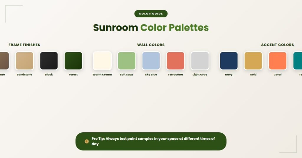
Colors will look truer and more vibrant in a sunroom. That paint chip that looked perfect under store lighting might feel too intense when bathed in afternoon sun. Always test samples in your actual space, observing them at different times of day.
South-facing sunrooms get warm, direct light that enhances yellows and oranges but can make cool blues feel harsh. North-facing rooms receive softer, cooler light that flatters blues and greens but can make warm colors feel muddy.
Coordinating With Adjacent Rooms
Your sunroom shouldn’t exist in isolation. Consider the rooms it connects to.
If your sunroom opens directly to your living room or kitchen, the color palettes should flow naturally between spaces. This doesn’t mean everything needs to match exactly—but the colors should feel like they belong to the same family.
A helpful approach: pull one accent color from the adjacent room and incorporate it into your sunroom, whether through wall color, furniture, or accessories. This creates visual continuity without requiring an exact match.
Furniture and Decor Colors
With your structural colors established, furniture and decor offer flexibility to add personality.
Outdoor-style furniture in wicker, rattan, or metal brings a relaxed, porch-like feel. Natural tones and textures work beautifully in sunrooms.
Indoor furniture makes the space feel more like a traditional room. Upholstered pieces in performance fabrics can handle the extra sun exposure while offering comfort.
Plants are the ultimate sunroom accessory. Greenery adds life and color while reinforcing the connection to nature. Consider the colors of flowering plants as part of your overall scheme.
Textiles like curtains, rugs, and throw pillows are the easiest way to introduce color you can change later. If you’re hesitant to commit to a bold wall color, use accessories to add pops of personality instead.
Popular Color Combinations That Work
Here are a few tried-and-true palettes to consider:
Classic and Bright: White frames, soft cream walls, natural wood flooring, and blue-and-white textiles. Timeless and fresh.
Warm and Cozy: Bronze frames, warm beige walls, terracotta tile flooring, and earth-toned furniture with green plant accents. Perfect for 4-season rooms.
Modern and Bold: Black frames, crisp white walls, gray concrete-look flooring, and minimalist furniture with one bold accent color.
Nature-Inspired: Green frames, soft sage walls, natural stone flooring, and wicker furniture with botanical prints. Brings the garden inside.
Coastal Casual: White frames, pale blue-gray walls, whitewashed wood flooring, and natural textures with sandy neutrals. Relaxed and airy.
Questions to Ask Yourself
Before finalizing your color choices, consider:
- Do I want my sunroom to feel like an extension of my indoor living space or more like an outdoor room?
- Am I drawn to warm tones or cool tones?
- Do I want a calm, neutral backdrop or a space with more color personality?
- How will the colors look with the view outside my windows?
- Will these choices still feel right in five or ten years?
We’re Here to Help
Choosing colors can feel high-stakes because you’ll live with these decisions for years. But remember—paint can be changed, furniture can be swapped, and accessories can be updated. The most permanent choice is your frame color, so give that one extra thought.
During your free consultation, we can show you frame finish samples and discuss how different options will look with your specific home. Sometimes seeing the actual materials makes the decision much clearer.
Ready to start planning your sunroom? Contact Cookeville Sunrooms for a free consultation. We’ll help you design a space that looks beautiful and feels like home.
Related Articles: